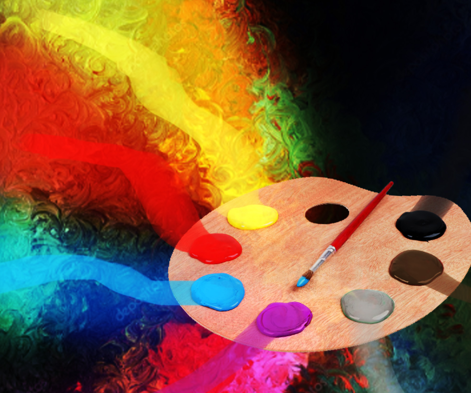
I have once before discussed how important of a role colors play in everyday human lives. Our visual memory makes us connect sentiment to various hues. But there are so many more colors than our traditional reds and greens and purples. Here, we will see what meanings lie beyond the rainbow.
We know that blue and green both give us a grounding sense of peace. But with these two colors blended to make turquoise, we have a whole new sensation. Turquoise evokes feelings of happiness and vibrancy and it is also said to connect the heart to spoken word. The bright color enhances communication abilities, so try speaking a heart-to-heart with the ones you love with this color nearby! It also gives clarity of thought if you want to think about what you want to say to the loved one.
Gold, not to be confused with its chipper cousin yellow, represents extravagance. This rich hue is a great detail to add to artistic projects because it adds flair that only the shiny metal can attain. In psychology, it symbolizes wealth and prosperity, and a special something for your 50th wedding anniversary.
On the other side of the spectrum, we have gray. This color in art has been called “unresponsive” in that it is truly neutral – gray only takes on the mood of the colors in its surroundings. While it is not captivating, it is mysterious and cool. It also represents dignity and wisdom, as seen in the graying hairs of the elderly who are wiser than we will ever be. Silver is a flashy version of gray that also equates to elegant and sleek design.
Beige, while being one of the most underrated colors, is one of the most essential in our lives. It is stereotyped as dull and boring, but it has been proven to be calm and relaxing (hence why so many walls and hallways are painted this color). It does not demand the eye’s attention, which can help enhance life’s simplicities and even emphasize the colors around it. In art, beige is often used as background scenes for its calming effects.
One of the first colors we see for a newborn baby girl is pink. Despite gender norms, pink represents all things bright and cute and delicate. It also symbolizes friendship childhood innocence. If you are painting a scene of youth, use pink tones to highlight the hope and innocence of young ones. The only apparent downside to pink is that it can appear as vulnerable and weak, and out of touch with reality. There are countless shades of pink, including magenta, fuchsia, and rose, so play around with them until you find the one with the right vibrancy that you may want.
The last color I’m going to talk about is brown, because it is the most dominant color of our Earth next to green. It is a dependable color that gives a sense of security. It is not associated with frivolity, but an artist can use brown (or any shade of it) when they want to evoke friendliness and warmth.
Playing with shades of the classic seven colors and mixing them can get you a world of emotions that can make your art stand out. Study these colors and even more psychological color theory to become a pro at choosing hues.
Ora Sorensen (orasorensen.com) was born in New York but grew up overseas in such countries as Libya, Turkey, Iran, Holland and Thailand. Her paintings are collected worldwide and have been shown in numerous exhibitions.


