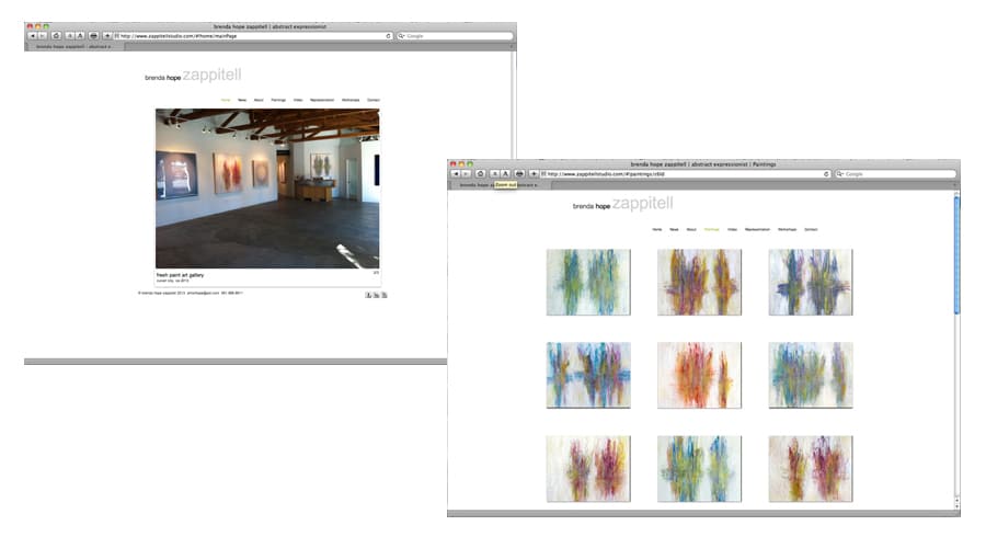
I do not claim to be an expert on websites. However, I have made my own website, changed it and managed it for the past six years. It has been my calling card so to speak, and I have gained representation with my website being the initial contact. So, I thought I would give you a few suggestions based on my experience.
First of all, there are many website companies that are great for artists, below is a list of some. I have used Artspan and am now using Wix — both have been great. I am not necessarily recommending any — check them out and see which appeals to you:
• Artspan
• Wix
When I first decided to make a website I looked at many other artists’ websites just to get an idea of what I really wanted. The one thing I noticed about the ones I really liked was there was clarity. They were easy to use, straightforward, not too much information, and they told you who the artist was from their images (abstract expressionist, realist, landscape painter, etc.).
Also, I was particularly drawn to the ones that had very little color, white backgrounds and not too many colors for the font. This made the work speak for itself and that is what I wanted — the website to be all about the work.
Here is a list of suggestions:
1) Stay away from black or other dark colors for the background — use white or something very light. I really think that white is best — it takes nothing away from the work. This is why most galleries have white walls.
2) Use as few headings as possible: about, news, paintings, install images, etc.
3) Don’t list your prices — this gives you flexibility especially if you are just starting out. Your prices may change quickly.
5) Make sure you label each painting with the name, size, medium and year made.
6) Do not put lots of series of work — remember, clarity. If you happen to paint landscapes, people and animals it is fine to list them separately. Just don’t list too much. Decide who you are as an artist and go with that.
7) Put SOME of your work on your website, not all of your work. I usually keep the newer work on my website.
8) Keep your artist statement short.
9) Put what will grab someone’s attention on the front page. You want to interest people there the most to have them look further. I usually put new work or install images from an ongoing exhibition.
10) Use click-throughs. In other words, if you have a gallery listed under representation make sure you can click it and go directly to the gallery. This is much cleaner than putting the web address for them next to the name.
11) Most importantly: have great images of your work. If you can’t take them yourself, hire a professional.
Once you have designed your website, make sure you update frequently, for those that look at it more than once, you want to keep their attention. Add new work, new events that are occurring, update your C.V., etc. The galleries that represent me oftentimes look at my website if they have a client who is interested in my work but want something different from what is in their inventory. My website is www.zappitellstudio.com, if you would like to take a look.


