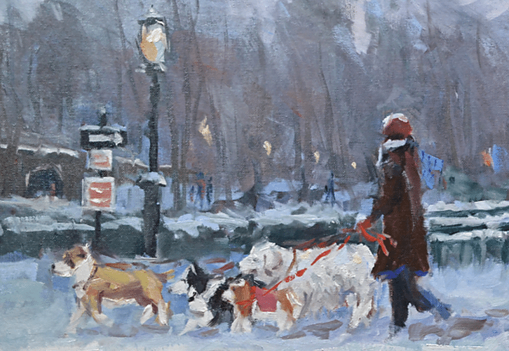
Artists can use color to evoke a mood or a feeling in their paintings.
The atmosphere of an icy winter afternoon is represented by a combination of colors from the cooler half of the color wheel. A bleak December landscape can chill the bones of a viewer, but can also bring to mind happy moments of the winter season — holidays with loved ones, streets bustling with shoppers, skaters in a snowy park.
From a cool red-violet to a deep pine-green, the winter colors span from either side of blue on the cooler side of the color wheel.
There’s a certain Slant of light,
Winter Afternoons –
That oppresses, like the Heft
Of Cathedral Tunes –
~ Emily Dickinson, 1830 – 1886
BLUE
The most universally favored color, blue is a cool and calming color that can lower the heart rate and induce mental relaxation. The color blue reduces the appetite and blood pressure. It is thought to enhance wisdom and confidence. Blue promotes loyalty, authority and reliability. Blue is a quiet and nurturing color, but can also represent sadness and depression.

GREEN
Green inspires harmony. It is nature’s most abundant color. A refreshing and gentle color, green promotes emotional balance and serenity. It is an optimistic color representing calm, endurance, growth, abundance and wealth. Green is also thought of as the color of envy, and of good luck.
VIOLET
A combination of red and blue, violet is the color of imagination. It is a color favored by children and has the highest vibration in the visible spectrum. It is a color associated with mysticism and spirituality, and thought to enhance psychic ability and meditation. It is a magical color, and also the color of power and royalty, penance and mourning.
Incorporate Winter’s Colors Into Your Art
[Best_Wordpress_Gallery id=”1″ gal_title=”Lee Haber”]
Artists can use the power of color to communicate a feeling, mood or message in their work.
Artist Lee Haber successfully incorporates the colors of winter into his beautiful Manhattan landscapes. After attending Pratt Institute, Haber founded Haber Design Group, an award-winning graphic design firm with many major corporate clients. After 27 years he decided to close up shop and pursue his passion for plein-air painting. Haber paints nostalgically recognizable locations using colors that evoke emotion.
His basic palette consists of the cool colors: Ultramarine Blue, Alizarin Crimson, Ultramarine Violet, and Lamp Black. Titanium White, Cadmium Yellow Light, Cadmium Orange, and Cadmium Red Light are also used. His combination of colors creates a chilly but happy environment, conjuring wistful memories of a place and time called winter.
Ora Sorensen (orasorensen.com) was born in New York but grew up overseas in such countries as Libya, Turkey, Iran, Holland and Thailand. Her paintings are collected worldwide and have been shown in numerous exhibitions.


